TRUTH BE TOLD
Designing a More Human Volunteer Experience
Creating a transparent, human, and motivating experience for volunteers, online and off.
Creating a transparent, human, and motivating experience for volunteers, online and off.
Truth Be Told is a nonprofit dedicated to empowering incarcerated women through storytelling, connection, and community-building. Their volunteer program is essential to delivering impact.
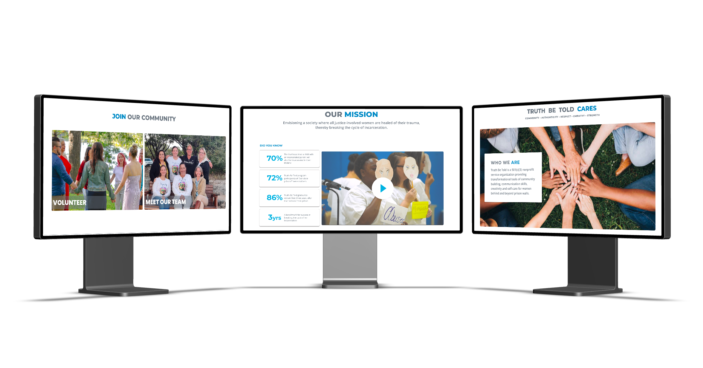
The digital experience made it hard for potential volunteers to understand what to expect, how to get involved, or whether they belonged. This wasn’t just a UX issue—it was a missed opportunity to build trust and drive impact.
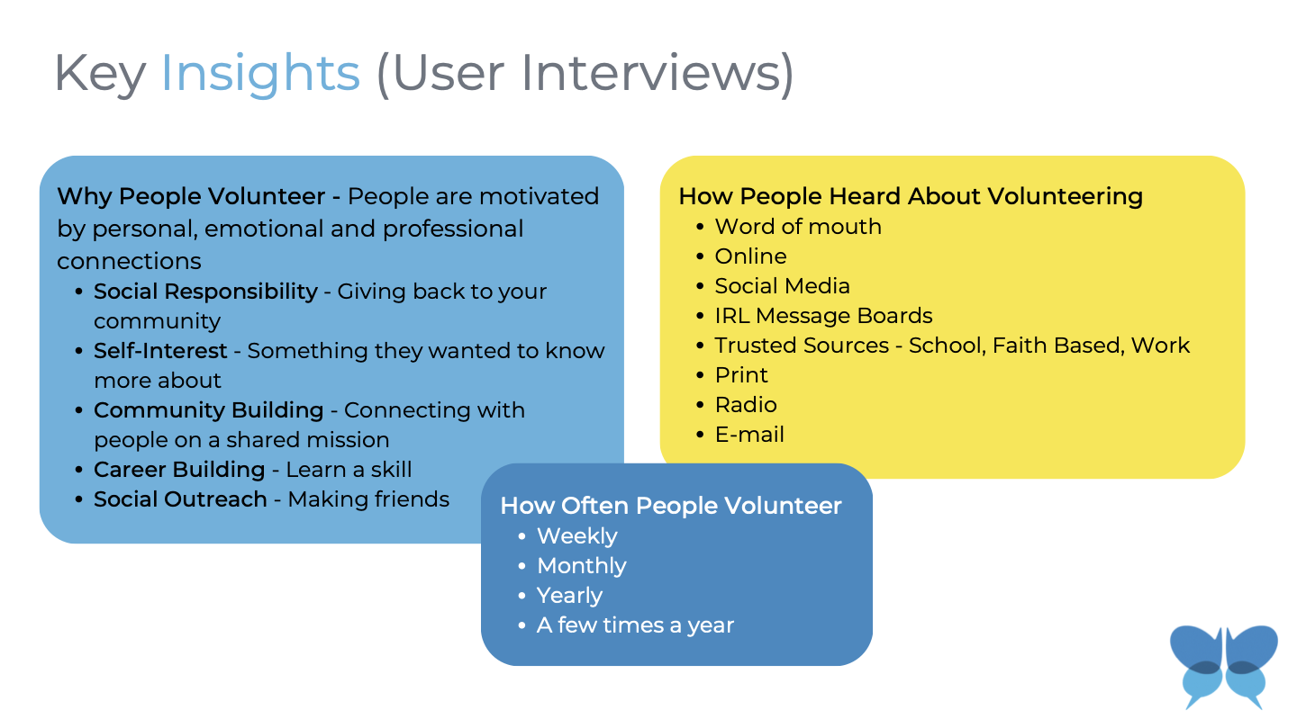
To better understand the challenges volunteers face during onboarding, we focused our interviews on people who had recently signed up. Their experiences were still fresh, making it easier for them to recall specific pain points—exactly the insight we needed to design a solution that felt timely, clear, and human.
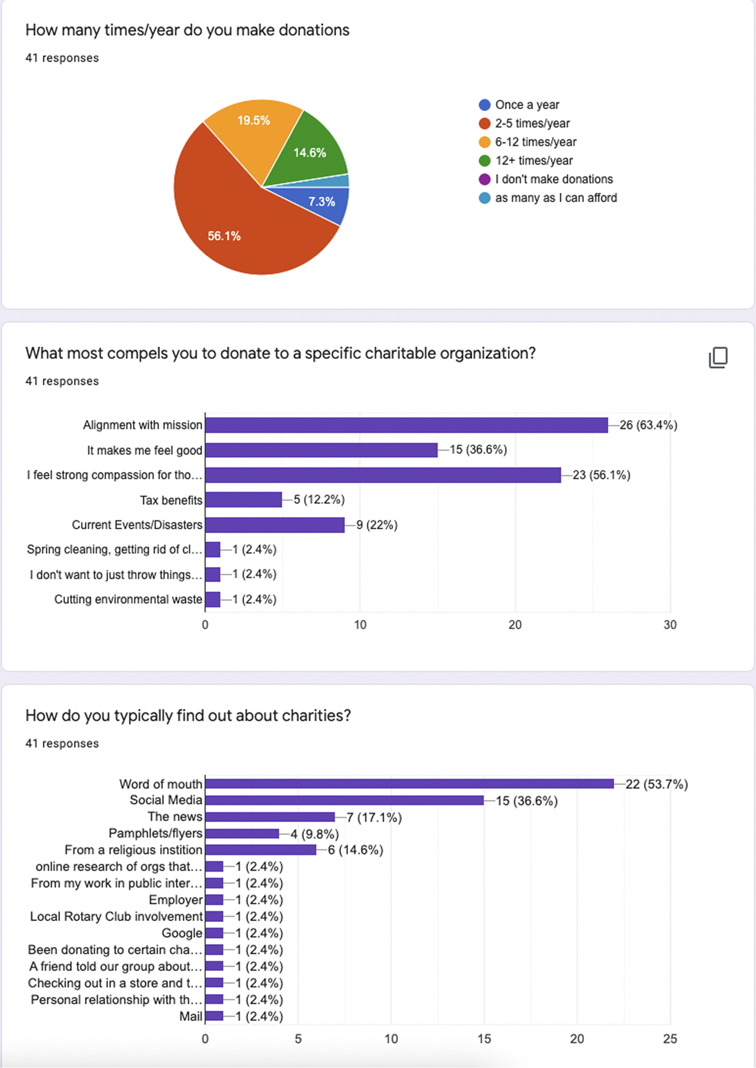
The site seemed passionate about the mission, but I couldn't find anything that helped me understand what a real day of volunteering looked like. If I'd seen someone walk through their experience, even briefly, I would've felt a lot more confident signing up.
I filled out the form, but then I didn’t hear back for a while. That made me second-guess whether I had done it right or if I was even needed. A simple confirmation or next step would’ve helped me feel like I was part of something, not just floating.
I wanted to help, but I couldn’t tell what the next step was supposed to be.
I’ve volunteered with a few organizations before, but this was the first time I felt unsure about the process. I wasn’t sure who I was supposed to talk to, what I’d actually be doing, or how my time would make an impact. That hesitation made me pause before signing up.
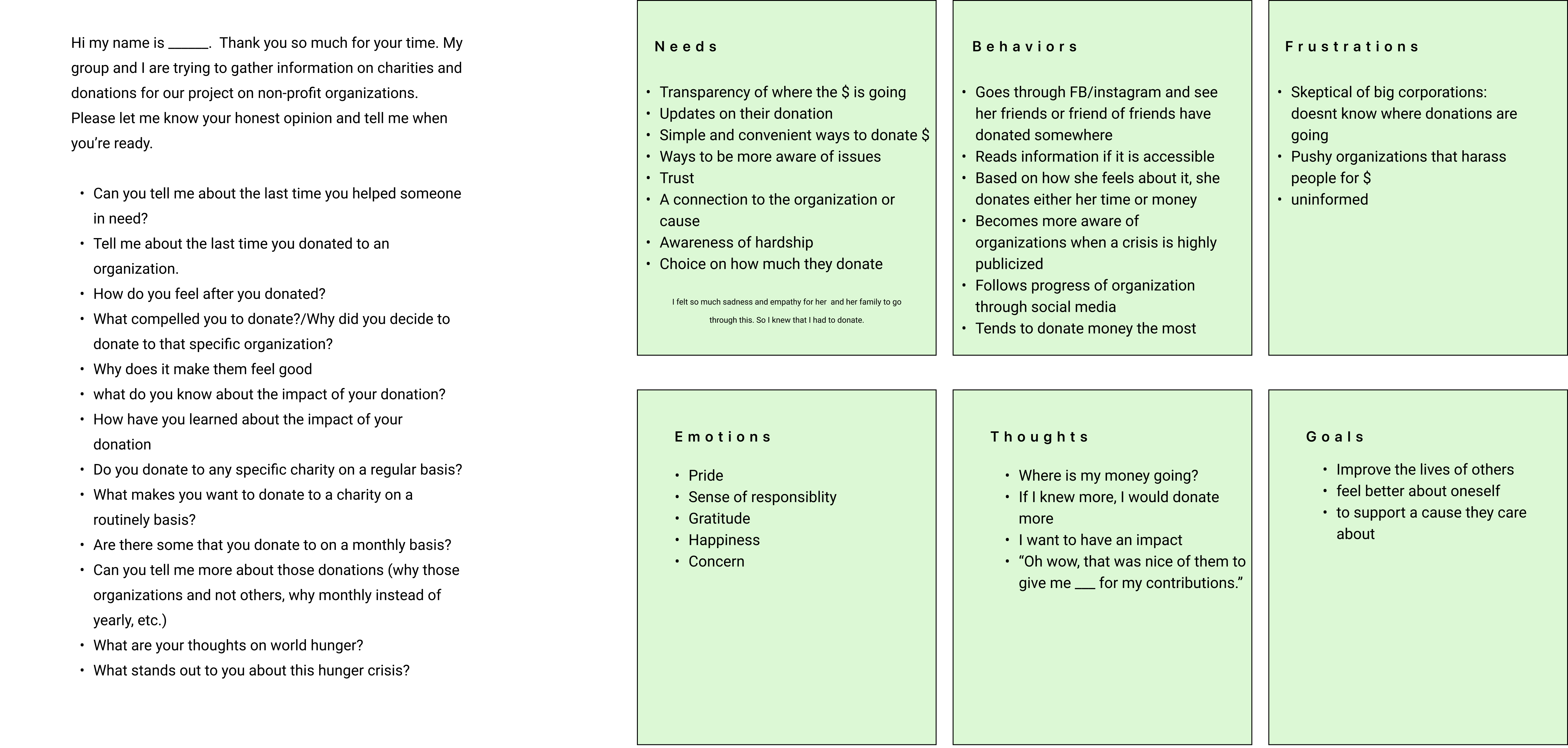
To help us empathize with the volunteers, we created a persona.
Our Persona, Marcia, was formed from the information we gathered during user interviews.
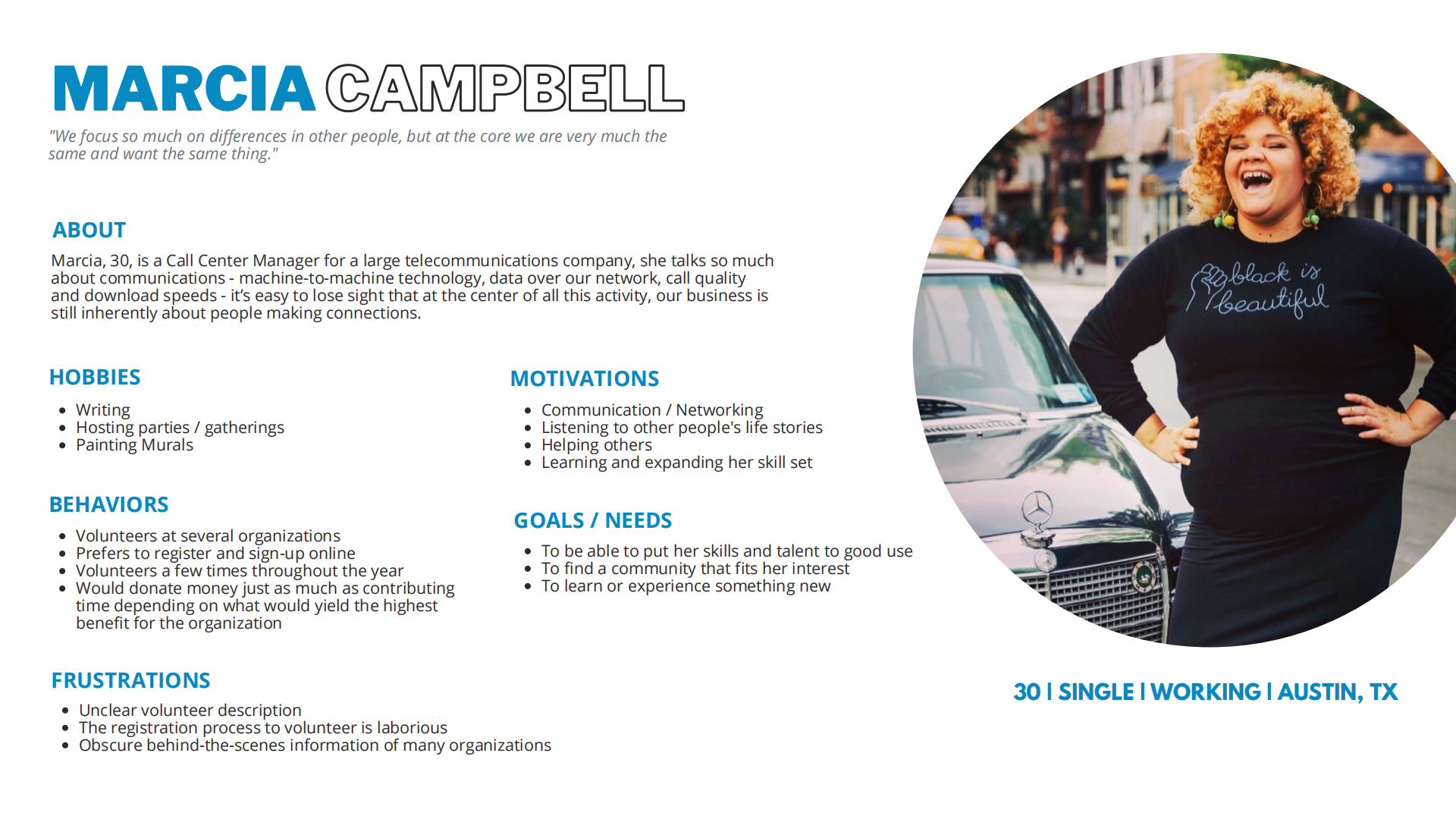
Marcia’s experience with the old site helped us map the emotional ups and downs of volunteering—from initial intent to real engagement.
_00.png)
- How might we help people feel confident joining?
- How might we build trust through clarity and transparency?
- How might we make the experience feel emotionally connected?
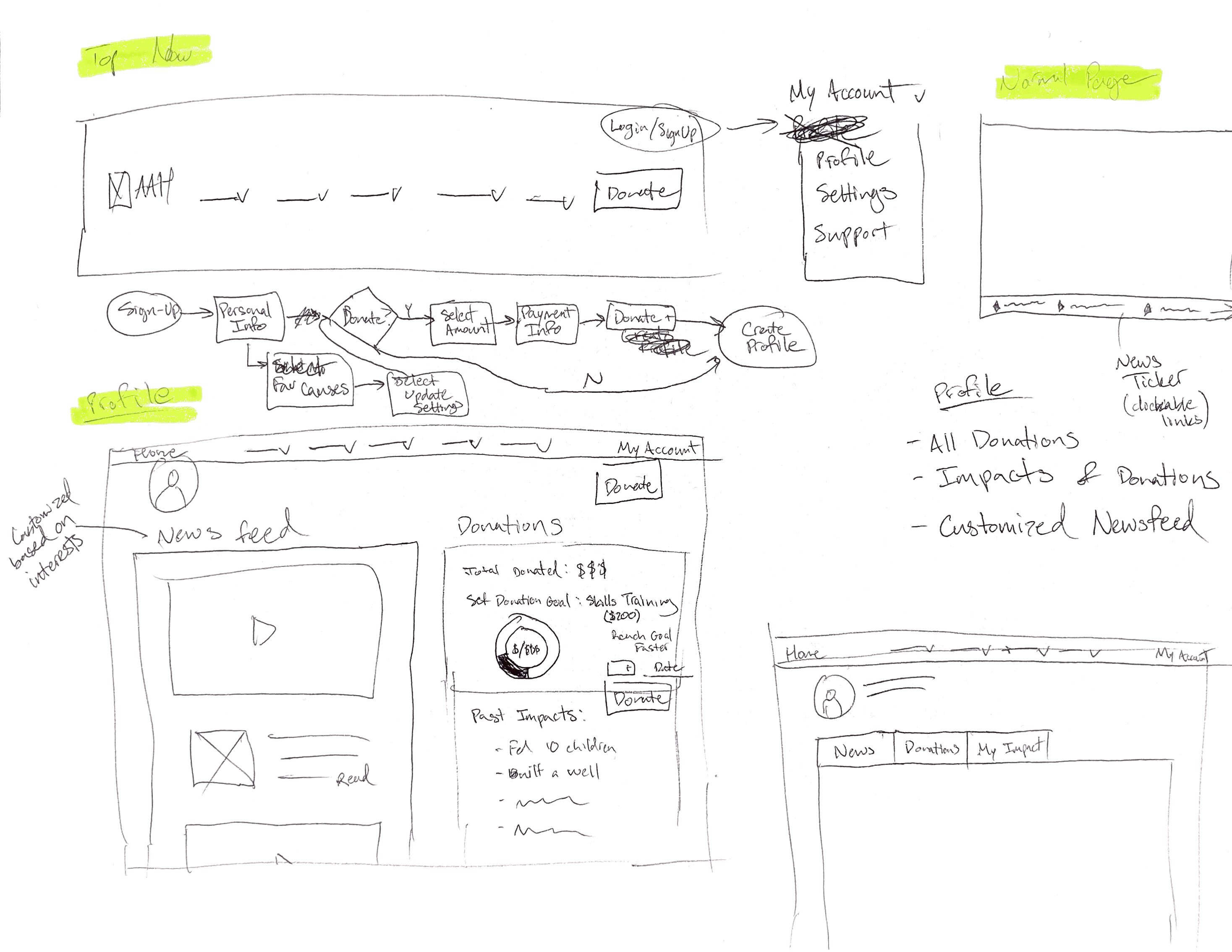
We began sketching and wireframing based on Marcia’s journey and the key friction points we identified. Our early concepts aimed to:
Our first wireframes emphasized layout clarity and content hierarchy, ensuring the site felt approachable and action-oriented.
We tested our high-fidelity prototype with 5 new volunteers matching our original user research profiles.
| Task | Original Site | Mid-Fidelity | Final Prototype |
|---|---|---|---|
| Register for a volunteer account | 70% 4/5 users |
70% 4/5 users |
100% 5/5 users |
| Find a role that matches their interests | 40% 4/5 users |
70% 5/5 users |
90% 5/5 users |
| Complete the onboarding steps | 50% 3/5 users |
70% 5/5 users |
90% 5/5 users |
| Connect with other volunteers | 30% 3/5 users |
90% 5/5 users |
80% 5/5 users |
This was more than a solo UX challenge—it was a true collaboration. Our diverse team brought different perspectives, and our shared goal was to create something human, honest, and helpful.